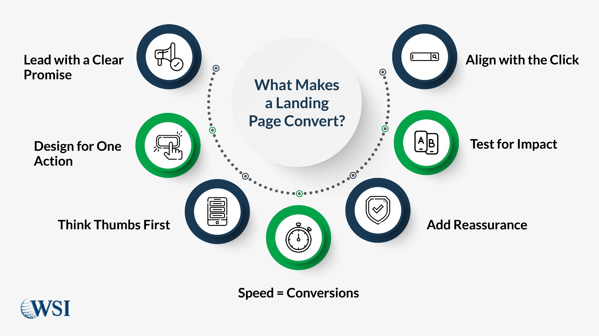
Landing page optimization is not about pretty layouts or clever slogans. It’s about intentional design decisions rooted in data. If your traffic is solid but conversions are stuck, the issue is rarely traffic quality; it’s your landing page. In Canada’s digital marketplace, where attention spans are short and choices are endless, optimizing your landing pages is one of the most controllable ways to improve ROI. Let’s walk through the systems behind conversion-focused landing pages and how to build one that works.
Key takeaways:
- High-performing landing pages follow structure, not guesswork.
- Every form, word, and section must serve the goal of conversion.
- Mobile-first and CRO principles are no longer optional.
Contents
- 1 Why Web Forms Are the Final Gate to Conversions
- 2 Why Most Landing Pages Don’t Convert
- 3 The Anatomy of a High-Performance Landing Page
- 3.1 Clear Value Proposition
- 3.2 Visual Hierarchy and CTA Design
- 3.3 Benefit-Driven Bullet Points
- 3.4 Trust Builders and Assurance Signals
- 3.5 Supporting Imagery That Reinforces Messaging
- 3.6 Minimal Navigation and Distraction-Free Layout
- 3.7 Embedded Video With Purpose
- 3.8 Exit-Intent Offers That Re-Engage
- 4 How to Align Messaging With Visitor Intent
- 5 The Role of Design: Above-the-Fold, Layout, and CTA Focus
- 6 What to A/B Test on a Landing Page (and What Not To)
- 7 Mobile-First CRO for Landing Pages
- 8 FAQ
Why Web Forms Are the Final Gate to Conversions
Most visitors don’t convert because your form makes them hesitate. It looks long. It asks too much. Or it appears when the visitor isn’t ready. Your form isn’t just a technical feature, it’s your handshake, your final pitch, and your trust builder.
- Ask only for what’s necessary (first name, email, and one qualifying detail max).
- Position the form above the fold on high-intent pages.
- Use trust signals like “secure,” “no spam,” or “free trial” beside the CTA.
- Reduce decision fatigue by using one clear CTA, not multiple competing options.
- Use smart defaults and auto-fill where possible to reduce user effort.
A form should feel like a low-friction next step, not a chore. Track where users abandon it, and fix those moments fast.

Not sure your landing page hits the mark?
Let us review your page structure and uncover quick wins. Our team specializes in conversion-focused landing pages for Canadian businesses.
Why Most Landing Pages Don’t Convert
A landing page isn’t failing for lack of effort, it’s failing from misalignment. You might be pouring energy into visuals and copy, yet missing what truly drives action. Before diving into landing page best practices, let’s look at why so many well-intentioned pages fall flat.
Lack of Clarity and Focus
Visitors scan. If your headline confuses them or the CTA blends into the background, you’ve lost them before they begin. Most landing pages try to be clever instead of clear. In trying to appeal to everyone, they end up resonating with no one.
Confusing value propositions, competing calls to action, and weak visuals create doubt. Doubt kills conversions. You have 5 seconds to make your promise clear. Make it count.
Misaligned Messaging With Visitor Intent
If your ad talks about “cost savings” and your page opens with “innovation,” you’ve already introduced friction. Visitors expect consistency. Your copy must mirror the language, tone, and intent that brought the visitor to the page.
Pages that convert match intent with precision. Start with customer pain points, reinforce their goals, and only then introduce your solution. That’s alignment. That’s how you increase landing page conversion.
Too Many Distractions
Pop-ups, auto-play videos, and sidebar elements may feel modern, but they often backfire. Every additional element competes with your CTA. Conversion-focused landing pages remove anything that doesn’t guide the user toward action.
Keep it clean. Keep it focused. Anything that isn’t helping is hurting.
Slow Load Times and Technical Friction
If your page takes more than three seconds to load, most visitors won’t wait. Load speed is a silent killer of conversions. Yet many businesses ignore it in favour of design flourishes that drag down performance.
Compress images, minimize scripts, and test page speed across devices. Optimizing for speed is foundational to landing page CRO.
The Anatomy of a High-Performance Landing Page

Every high-converting page follows a structure. It starts with clarity, builds with intention, and ends with action. This section breaks down the must-have elements that work together to drive results. If one piece is off, your entire landing page CRO effort takes a hit.
Clear Value Proposition
The headline is not a tagline, it’s a promise. Make it loud, concise, and relevant. Support it with a subheadline that reinforces the benefit. Clarity here improves every metric downstream.
Strong landing page CRO begins with a value proposition that answers: “Why should I care right now?” Use customer-first language to signal that you understand their world.
Visual Hierarchy and CTA Design
Your layout must guide the eye. Use contrast, spacing, and directional cues to lead users toward the action. CTAs must pop visually and be written in outcome-driven language (“Get My Quote,” “See My Plan”).
Too many links create exit points. Strip the noise. One CTA per landing page is a best practice unless you’re testing alternatives.
Benefit-Driven Bullet Points
Highlight benefits, not just features. Use bullet points that quickly answer the visitor’s question: “What’s in it for me?” Make each point scannable and written in active voice.
Avoid technical jargon unless it’s relevant to the buyer. Clarity and outcome-focused language will always outperform buzzwords.
Trust Builders and Assurance Signals
Use real-world proof points like client logos, secure payment icons, and satisfaction guarantees. These reduce anxiety and signal legitimacy.
Place them near the CTA or form. Visual trust elements remind visitors they’re making a safe decision.
Supporting Imagery That Reinforces Messaging
Every image should support the copy, not distract from it. Avoid generic stock photos. Show your product in use or feature a real customer scenario.
Images with people looking toward the CTA or copy tend to guide user focus. Test different image placements to see what resonates best.
Navigation menus give visitors an easy exit. Remove top navigation, footer links, and unnecessary sidebars. Your landing page is a funnel, not a highway.
Focus every visual and word on getting the user to the CTA. That’s how you reduce friction.
Embedded Video With Purpose
Use short videos that explain the offer, show the product, or feature a customer story. Video increases time on page and builds trust when done right.
Keep videos under 2 minutes and make sure they load fast on mobile. Always include captions to support silent autoplay.
Exit-Intent Offers That Re-Engage
Use smart popups that trigger only when a visitor shows signs of leaving. Offer something smaller, like a checklist, free demo, or trial extension.
Done correctly, exit-intent popups can recover lost leads without annoying high-intent users.
How to Align Messaging With Visitor Intent
The language that brought the visitor in should guide what they see first. That means your headlines, hero image, and CTA must reflect the offer’s original context; be it a paid ad, social post, or email link. Don’t pivot the conversation. Continue it.
To better align messaging with visitor expectations:
- Match headline copy to the phrasing used in the ad or search result.
- Keep tone and style consistent across the ad, landing page, and CTA.
- Use similar language patterns and keywords to create a seamless experience.
- Deliver the promise you made in your ad within the first scroll of the landing page.
Effective messaging also adapts to audience sophistication:
- A first-time visitor may need reassurance, simplicity, and social proof.
- A returning user likely wants deeper product details or pricing.
- Tech-savvy audiences want precision and examples, not fluff.
- General audiences respond better to clear benefits and fewer choices.
Smart segmentation has a direct impact on conversion-focused landing pages. Even modest personalization, like location-based copy or tailored testimonials, can lift engagement fast.

Test smarter, not harder.
We’ll help you run A/B tests that drive actual results—no more wasted time on button colours and dead-end variants.
The Role of Design: Above-the-Fold, Layout, and CTA Focus
Design decisions aren’t about decoration, they’re about direction. Every layout choice either guides visitors to your CTA or distracts them from it. This section breaks down how to use layout, structure, and visual hierarchy to move visitors toward conversion with purpose.
Above-the-Fold Matters More Than You Think
What your visitor sees first influences bounce rate more than any other design element. Keep the headline, CTA, and one supporting visual or benefit above the fold on both desktop and mobile.
Avoid carousels and automatic sliders. They distract. Static clarity wins. Heatmaps often show that scroll depth increases when the first screen answers the user’s core question.
To maximize your above-the-fold performance:
- Keep copy tight, relevant, and visually aligned with your CTA.
- Avoid motion-heavy elements like sliders that can delay loading.
- Include visual cues (like arrows or eye direction in photos) that guide attention.
- Ensure your key message is visible on all screen sizes without scrolling.
CTA Placement and Design Rhythm
Calls to action should appear at natural decision points. One at the top. One after social proof. One at the close. All must say the same thing with the same level of urgency.
Use high-contrast buttons, short action verbs, and microcopy that eliminates doubt (e.g. “Takes 30 seconds,” “No credit card needed”). Repetition without redundancy reinforces action without fatigue.
Improve your CTA performance by:
- Using contrasting colours that stand out from the rest of the layout.
- Making CTAs consistent across desktop and mobile.
- Avoiding vague CTA text like “Submit”, be specific about the result.
- Placing CTAs after each major benefit or value section to catch motivated users.
What to A/B Test on a Landing Page (and What Not To)
A/B testing is how you go from guessing to knowing. It’s your best method for identifying what truly influences conversions. When done right, it uncovers quick wins and long-term improvements without overhauling your entire page. Let’s break down what deserves your testing attention, and what doesn’t.
Test Headlines, CTA Copy, and Form Fields First
Start with the elements that directly influence action:
- Headlines shape first impressions and determine scroll behaviour.
- CTA copy drives final clicks, tests clarity, urgency, and tone.
- Form field length and label wording affect form completion rates.
- Subheadlines that explain benefits can increase engagement.
A/B testing landing pages isn’t about guessing, it’s about isolating what matters. Use tools like Google Optimize, Unbounce, or VWO to structure and measure tests. Always run one test at a time to maintain clarity.
Don’t Waste Time Testing Colours or Button Shapes Early
Colour palettes and button roundness can matter later, but they’re not where your biggest gains will come from. Until your copy, structure, and value proposition are dialed in, don’t waste cycles on cosmetic tests.
Focus less on design accents and more on user flow:
- Avoid testing colour changes unless you’ve exhausted content tests.
- Don’t obsess over animations or hover effects.
- Stick to high-contrast buttons until you’ve hit conversion goals.
Use analytics and heatmaps to see what users interact with first. Prioritize those areas in your A/B testing roadmap.

Your message is clear—now make it convert.
We help Canadian businesses align ad traffic with landing page content for maximum ROI. Precision in messaging means more qualified leads.
Mobile-First CRO for Landing Pages
Mobile design is no longer a nice-to-have, it’s the front door to your conversions. The majority of your visitors are making snap decisions on a phone screen. If your page isn’t built for mobile-first experiences, you’re leaving money on the table. This section shows you how to craft a landing page that feels effortless on mobile devices.
Design With Thumbs, Not Mice, in Mind
Most Canadian consumers visit landing pages on mobile first. That means buttons must be thumb-friendly, text must be legible, and layout must scroll smoothly. Avoid pop-ups that block the CTA.
Test on real devices, not just simulators. Click-through rates drop fast when mobile friction rises. Responsive design is no longer enough. You need mobile-first design principles that optimize user experience from the first scroll.
Prioritize Speed and Clarity
Speed is CRO fuel. A delay of just 1 second can reduce conversions by up to 20%. Use lightweight images, compress scripts, and preload critical content. Google’s PageSpeed Insights can help spot bottlenecks.
Clarity means fewer distractions. Keep mobile layouts linear. Don’t hide the CTA behind collapsible menus or endless scrolling. Make the action obvious and available at all times.
Keep Forms Mobile-Friendly
Form friction gets amplified on smaller screens. If your input fields are stacked too tightly or ask for too much, users will abandon the process. Limit your mobile forms to 3–4 fields max and use large touch targets.
Use autofill for name and email. Consider using multi-step forms to reduce overwhelm. Test each version for tap accuracy and drop-off rate. Make sure the submit button is big, clear, and spaced from the screen edge.
Optimize Typography and Tap Areas
If users have to pinch-zoom to read your message, you’ve already lost them. Mobile typography needs to be large enough to read at a glance without crowding the layout. Stick to high-contrast text and break up long paragraphs.
Tap areas, like CTAs and form buttons, should be spaced for fat thumbs, not mouse clicks. Use 44px as a baseline target size. Group related elements and use whitespace to separate decision points. Mobile readability directly impacts your conversion-focused landing pages.
FAQ
What’s the difference between a landing page and a homepage?
A landing page serves one purpose: conversion. A homepage introduces a brand. If your goal is to increase landing page conversion, separate your landing strategy from your main site.
How long should a landing page be?
Long enough to answer objections, short enough to avoid fatigue. The more expensive or complex the offer, the longer the page should be. Use analytics to guide your length.
Yes. In most cases, top nav adds distractions. Landing page best practices favour focused attention. If they want to learn more, guide them after conversion.
How often should I run A/B tests?
Monthly is a good baseline. Start small, CTA text, form layout, and then move to bigger changes like headlines and page length. Consistency matters more than frequency.
Strengthening Your Landing Page Strategy
Landing page optimization is not a one-time fix, it’s a practice. As markets shift and user behaviour evolves, so should your approach. Make it a monthly ritual: review your pages, analyze your CRO metrics, and A/B test one element at a time. If you’re not actively testing, you’re guessing. And if you’re guessing, you’re likely losing conversions you could have won.

Let’s turn your traffic into leads.
You’ve got the clicks—now let’s get the conversions. Leap Digital builds data-backed landing pages designed to perform.

