

If your form doesn’t convert, your website won’t either. Every headline, every call-to-action, every single persuasive paragraph, all of it leads to one moment: the form. It’s the final stop in your buyer journey, the gateway to lead generation, and the difference between a bounce and a booked call. Form optimization makes or breaks that moment.
Key takeaways:
- Forms are the final gate between interest and action, optimize them or lose conversions.
- Small UX changes like better micro copy and layout tweaks lead to major results.
- Testing and refining your forms is the fastest way to improve ROI.
Contents
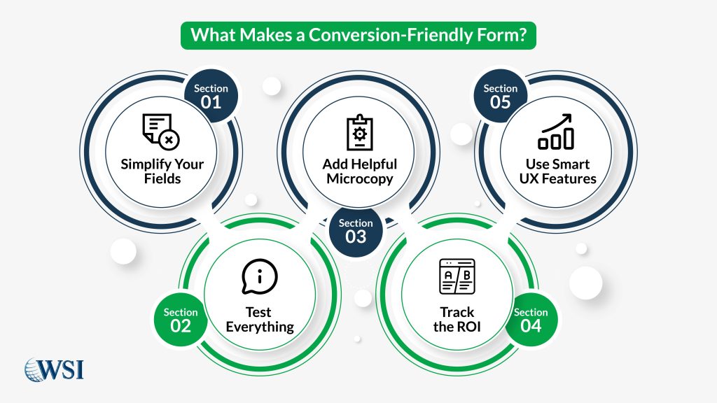
- 1 Why Form Optimization Makes Web Forms the Final Gate to Conversions
- 2 The Psychology Behind Form Friction and Abandonment
- 3 Single-Step vs Multi-Step Forms: Which Form UX Design Wins?
- 4 How to Use Micro Copy to Guide Form Completion
- 5 What Form Fields to Keep and What to Kill
- 6 Conditional Logic, Auto-Fill, and Other Form UX Design Enhancers
- 7 A/B Testing Forms: CTA Text, Length, and Layout
- 8 The ROI of Great Form Design (with Real Data)
- 9 Unlocking Growth Through Form Optimization
Why Form Optimization Makes Web Forms the Final Gate to Conversions
You’ve invested in great content, slick design, and smart call to actions (CTAs); but without form optimization, your buyer journey has no closure. This is the tipping point. Form optimization bridges the gap between interest and action, making your web form the ultimate conversion checkpoint.
A well-built form doesn’t just collect data. It delivers trust. It confirms your value. It signals that clicking “Submit” is worth the user’s time. Your visitor is ready to engage, and the form is your last, and best chance to secure that commitment.
Here’s why form optimization is mission-critical:
- It captures core user data like names, emails, purchase intent, and more.
- It marks the completion of your funnel; turning traffic into leads, leads into revenue.
- Even small enhancements, like clearer field labels or better button copy, can create major upticks in completions.
- It sets the tone for future interactions. A smooth, reassuring form experience builds long-term trust.
Did you know?
Nearly 70% of users abandon forms that feel too long or unclear. Streamlining and simplifying can dramatically shift your conversion rate upward.
Form optimization isn’t a one-time adjustment; it’s a continuous opportunity to align UX with business goals. When your forms work, your entire digital strategy performs better.
Everything on your site builds toward your form. Your value proposition, your testimonials, even your CTA buttons; they all aim to guide users to that final interaction. A form is more than a final step; it’s your digital handshake. If it feels confusing or demanding, visitors hesitate. If it flows, they move forward.
This is why form optimization plays such a vital role. A strong form collects key data like email addresses, payment details, and intent signals. It also provides a sense of trust and professionalism. It reflects your brand’s attention to detail and gives users a reason to take the leap.
Even the smallest tweaks; adjusting button copy, reducing field count, clarifying instructions can lead to big improvements in performance. The average web form converts at just 1–3%, but optimization efforts can double that. You’ve already won their attention. Now, make sure you capture their action.
The Psychology Behind Form Friction and Abandonment
Every form creates a moment of decision. That moment can feel like a pause or a full stop. Friction is the hesitation a user feels before completing the form. If you don’t address it, you lose the lead.
Friction happens for different reasons. Sometimes the form looks complicated. Sometimes users aren’t sure what you’re asking for. Other times, they feel uncertain about how you’ll use their information. Each point of friction adds resistance, and too much resistance causes a drop-off.
Common culprits:
- Cognitive overload: Too many form fields. Confusing instructions. Poor layout.
- Trust concerns: Asking for sensitive details too soon (like phone numbers or birth dates).
- Perceived effort: Long forms look like work. People avoid effort online.
The most common triggers include cognitive overload, trust concerns, and perceived effort. Too many form fields, vague instructions, or requests for personal data can make users anxious. Your role is to design forms that reduce these triggers. Use fewer fields, add clarity, and build trust. When you remove the mental weight, you make it easier for people to complete the process.
Single-Step vs Multi-Step Forms: Which Form UX Design Wins?
Not all forms are created equal. The structure you choose can either encourage completion or spark hesitation. That’s why selecting between a single-step and a multi-step form isn’t just about aesthetics. It’s about aligning the form’s experience with your audience’s expectations, the complexity of your offer, and the depth of information required.
| Type | Pros | Cons | Best Use Cases |
| Single-Step | Quick to complete. Everything is visible upfront. | It can look overwhelming if fields stack too high. | Free downloads, newsletter opt-ins |
| Multi-Step | Feels easier. Shows progress. Reduces anxiety. | More clicks are needed. Some users might exit early. | Job applications, onboarding, surveys |
Single-step forms work well for simple asks. Think newsletter sign-ups, free trials, or ebook downloads. The fewer the fields, the less mental effort required. These forms provide instant gratification. However, if you cram in too many questions, it can appear messy and scare users off before they begin.
Multi-step forms are built for depth. They divide complex actions, like consultations, onboarding, or purchases, into manageable parts. Each step builds momentum. Users feel progress as they move forward. Still, every new click introduces a small chance of drop-off. So each step must be clear, concise, and purpose-driven.
Choosing between these two comes down to your goal. If you want speed and low commitment, go single-step. If you want higher-quality data and more thoughtful submissions, lean toward multi-step. Either way, form optimization ensures whichever route you take actually works.
How to Use Micro Copy to Guide Form Completion
Micro copy is the smallest copy with the biggest impact. It’s the subtle language users barely notice, yet it plays a major role in reducing friction and guiding them to completion. From placeholder text to inline instructions, every word needs to serve a purpose. This is how you earn trust, reduce confusion, and help users stay on track, especially when forms get long or ask for sensitive data.
Here’s how to make it work:
- Field hints: Be precise. Tell users exactly what’s expected; e.g., “Enter your work email” is far more helpful than “Email.” If you’re collecting complex inputs like phone numbers or security answers, give format guidance so users don’t guess.
- Helpful error messages: Clarity matters here. Nobody wants to see red text without a solution. Instead of “Invalid input,” try “Please enter a valid 10-digit phone number.” That difference turns user frustration into action.
- Reassurance text: Build confidence. Remind users their data is safe with a simple line like “We respect your privacy and won’t spam you.” This type of micro copy softens the emotional hesitation users feel before hitting submit.
When written with intent, micro copy clears the path forward. Every label, hint, and helper message becomes a small conversion assistant, keeping your visitors engaged and less likely to abandon your form.
What Form Fields to Keep and What to Kill
Every field you add comes with a cost. It asks for more time, more attention, and more trust. Unless there’s a strategic reason to include it, it shouldn’t be there. Simpler forms don’t just convert faster, they signal that you value your users’ time.
Stick to the essentials:
- Only ask for data you’ll actually use to qualify or follow up with a lead. If a field isn’t necessary for the next step in your sales process, cut it.
- Remove fluff like “How did you hear about us?” unless you’re actively using that data to inform attribution.
- Track field-level abandonment using form analytics tools like Hotjar or Formisimo. See which questions are causing friction, and test removing them.
- Consider progressive profiling. Ask for the basics upfront, name and email, then collect more details later when the relationship deepens.
The goal is clarity and momentum. Every unnecessary field becomes an exit point. Instead, create lean forms that prioritize action.
Conditional Logic, Auto-Fill, and Other Form UX Design Enhancers
Today’s smartest forms don’t ask everyone the same thing. They adjust based on the user’s input. This is where UX and technology combine to create personalized, frictionless experiences.
Here’s what to take advantage of:
- Conditional logic: Customize the experience. If a user selects “Business Owner,” show a follow-up asking how many employees they have. If they pick “Student,” show a different question. This makes forms feel relevant and efficient.
- Auto-fill: Use browser memory and device autofill options to speed things up. When fields populate automatically, the mental load drops and users move faster.
- Input masks: Guide users through formatting, especially for phone numbers, dates, or postal codes. Input masks keep data clean while making entry more intuitive.
- Live validation: Provide feedback before submission. Flag errors in real-time instead of after clicking submit. It’s more helpful and saves users the frustration of guessing what went wrong.
Together, these features turn your forms into responsive, user-aware tools. They reduce unnecessary effort and show that you’ve built the form with your audience in mind.
A/B Testing Forms: CTA Text, Length, and Layout
You can’t improve what you don’t measure. A/B testing takes the guesswork out of form design by showing what your actual users prefer. Even small changes can unlock major performance gains.
Start with these elements:
- CTA buttons: Test copy that focuses on outcomes. Compare “Get Started” with “See Pricing” or “Book Your Free Call.” The right phrase often speaks directly to user motivation.
- Form length: Try short vs. longer forms and measure completion vs. quality. In some industries, longer forms deter unqualified leads while signaling higher intent.
- Layout: Try different field groupings. A single-column vertical layout often works best on mobile, while multi-column formats can improve scanning on desktop.
Did you know?
Just tweaking your CTA button can lift conversions by over 30%.
What matters is the data. Testing turns assumptions into insights. When you optimize based on performance, every change pushes ROI upward.
The ROI of Great Form Design (with Real Data)
Form optimization is one of the most efficient ways to increase conversions without increasing ad spend. The return is immediate and compounding.
Here’s what we know:
- A SaaS company saw a 160% lift in conversions by reducing form fields from 11 to 4.
- An e-commerce brand increased submissions by 25% by testing button copy and moving from “Submit” to “Claim My Offer.”
- Trust-building phrases like “Your information is secure” dropped abandonment by up to 30% across multiple industries.
These are not anomalies. They are proof that better form design drives results. It earns trust. It encourages follow-through. It delivers measurable value every single day.
If you want to boost lead generation, start with your form. The fastest path to more conversions starts with removing resistance one field at a time.
Unlocking Growth Through Form Optimization
Committing to form optimization is not just a UX fix, it’s a business strategy. You’ve now seen how each piece matters: shortening fields, adding micro copy, choosing the right layout, and testing relentlessly. Together, these tactics form the core of high-converting, conversion-friendly forms.
You improve the user experience. You reduce form abandonment. You gain better data and higher ROI.
This is where digital momentum becomes measurable growth. Every optimized field, every simplified step, and every clarified instruction leads to more conversions.
Now is the time to take action. Audit your current forms. Cut the clutter. Refine your flow. Test with intention. Then measure, iterate, and grow.
You’re not just improving forms, you’re building a lead-generation system that works for you 24/7.